
Pantone has announced that their ‘Colour of the Year’ for 2019 is Living Coral – So what? Is this something you need to worry about or try to include in your project? We think not.
While it is important to keep abreast of style trends and have a finger on the pulse of the design world it is also important to make sure projects are judged for success in and of themselves, not against a passing trend. What happens when next year’s colour is announced for instance?
At the risk of sounding cynical, let’s have a closer look at how these things happen.
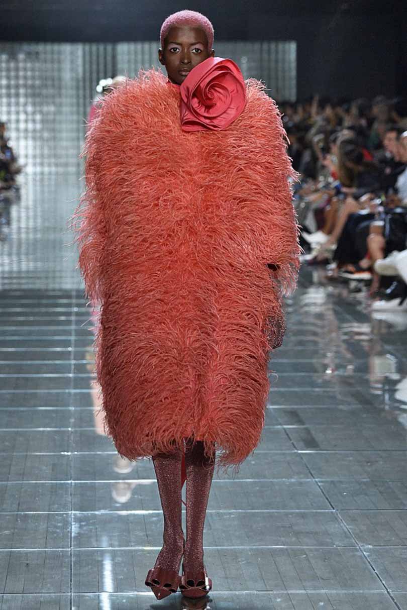 According to Leatrice Eiseman, executive director of the Pantone Colour Institute, colours are selected based on a range of influences including film and design, fashion, sports, technology, visual art and nature. This year nature was a big influence with Pantone alluding to the worldwide bleaching of the coral reefs as incentive – “Some of them are endangered… Just like coral nurtures marine life, we want to nurture the colour and keep it alive.”
While the choice of colour may be carefully considered, and even in this case perhaps lauded for drawing attention to an environmental issue, it is a part of a very corporate and consumer driven process.
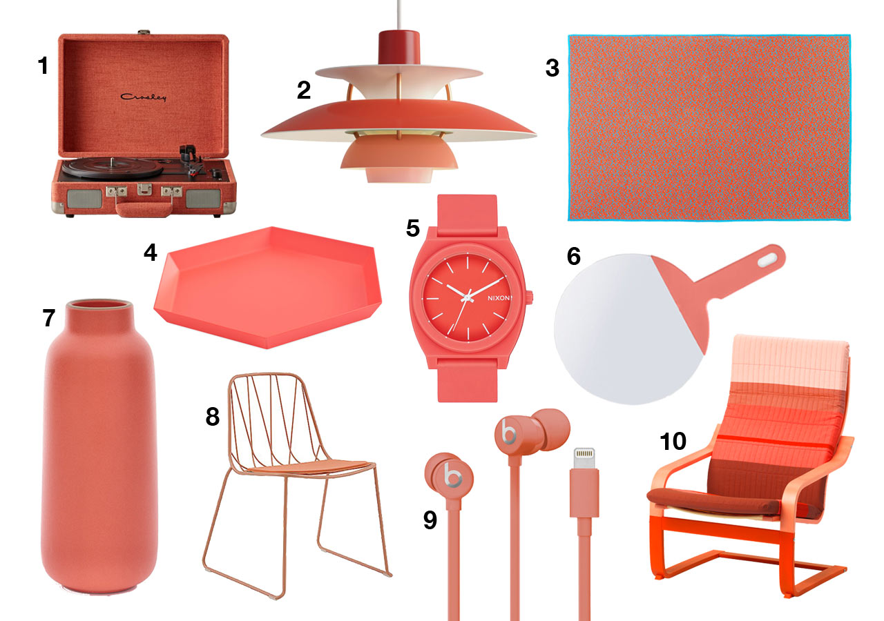
Companies can pay for early access to pantone’s colour of the year, and even purchase
trend forecasts for spring /summer 2020, at a premium of £768. What this means for consumers is a raft of products are created on the basis of these predictions, with accompanying marketing re-affirming that these items are ‘on-trend’ – creating a self fulfilling prophecy.
Don’t get me wrong, Colour is incredibly important. Humans are primarily visual creatures and the way we experience our environment is mostly through sight – colour and light. The colours we choose to surround ourselves with have a profound impact on our emotional and psychological state so we should pay close attention when specifying them for projects.
Whether you want to create a sense of calm, excitement, intrigue – or to subtly reinforce your brand – colour is a vital consideration when planning your project. A colour should be chosen for its merits specific to your projects needs, not because of it’s coverage in the press- no matter how ‘on-trend’ it is.
Why not get in touch with Wall to discuss how we can help you use colour correctly in your project?